
Designing the website to promote Quilly's social app and provide necessary resources for young women
Team
1 Design Manager
3 Designers
2 Engineers
My Role
Qualitative Research
Conceptualization
Design
Web Development
Implementation
Duration
~6 months (Ongoing)
Don't have time to read?
Here is a TL;dR version!
Quilly needed a website that made college women feel seen before downloading the app. Over ~6 months, I led research, defined a bold playful visual direction, and built out a reusable component library + CMS integration.
Result: 64% faster load times, 37% longer sessions, and task success up from 65% to 92%.
Background and Problem
People weren't finding their people in college.
Why was this happening?
Imagine walking onto a new college campus knowing nothing and no one.
Students were surrounded by opportunities to socialize, yet there was no clear way to find people who actually shared their interests, values, and identities.
Through interviews and surveys, I used key insights to explore design opportunities across key moments in the student journey, helping Quilly focus on making it easier for students to find their people.
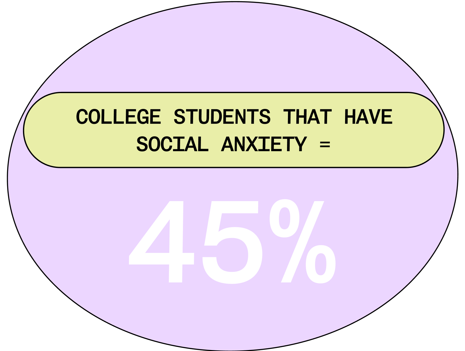
42%
of college women said they struggle to find people they truly connect with on campus
35%
said existing social platforms feel performative or inauthentic
31%
said they often attend events but still leave without making meaningful connections
but... what is quilly?
Quilly is a female-founded social platform built to help college women find community through shared interests, campus events, and social content.
It connects students to people and spaces that feel aligned with who they are, not just who happens to be nearby.
The website is more often the first place a student meets Quilly. Before downloading the mobile app, they come here to understand what Quilly is, whether it feels trustworthy, and whether it feels like it is worth exploring.

Problem Statement Section on Home Page
Role n' Goal
We needed to spread quilly's online presence
Our audience is deciding two things in a matter seconds:
Is this made for me?
If the visual language, tone, and energy of the site does not match their world, they leave before ever learning what Quilly does.
Is this worth my attention?
Gen Z women move fast through content. A site that feels flat, dated, or generic gets skipped, no matter how meaningful the product behind it is.
For Quilly, the website was not just informational, it was the front door to the app. If it did not feel emotionally aligned, modern, and visually compelling, users would never make it far enough to join the waitlist or download the product.
feel seen faster
A website that immediately reflects the world, voice, and energy of college women so they know Quilly is for them.
download with confidence
A clear, engaging experience that shows what the app does and why it is worth joining before asking for a signup.
Focus Areas
Let's design with Intention and Relevance!
Before designing anything new, we tested the legacy website to see where users were getting lost, what captured their attention, and what failed to convey the brand. These sessions revealed friction points, confusing layouts, and areas where the site simply did not feel engaging to our target audience.
All design directions then took these learnings and explored solutions across key touchpoints from homepage to content pages. By the end of the journey, we had a more holistic, cohesive, and emotionally resonant experience that aligned with the students we wanted to reach.

❌
inconsistent design throughout website, no clear product advertisement
What did the old version tell us?
With user and stakeholder input synthesized, I defined the following problem statements:
1.
Users can’t trust or engage with a platform that feels outdated or unintuitive.
2.
Lack of CMS makes content static and time-consuming to manage.
3.
Existing design lacks maturity and fails to emotionally connect with users.
Designing
Defining a visual identity that would attract college women and better promote the Quilly app
To reposition Quilly as a platform that felt welcoming, modern, and worth downloading, we explored multiple visual directions for the website. Our goal was to find a style that not only looked polished, but actively encouraged users to engage with the product and take action.
Idea 1: Clean and Minimal
We experimented with a neutral palette and a distinct cell-based layout to organize content in a clear and modular way.
The design emphasized cleanliness, readability, and familiarity, aiming to feel trustworthy and professional.

❌
Users did not think the website was aesthetically pleasing and still unclear of its puprose
Idea 2: Bold and Playful
Our second direction took a more expressive approach.
We introduced a brighter color palette with high-contrast accents, more dynamic typography, and touches of neubrutalism to give the site a playful, energetic edge. The cell-based structure remained, but was paired with stronger visual hierarchy and more intentional product placement.

✅
Users liked the consistent brand identity stating it felt more authentic, also clearly understanding what the purpose of the website and app was
Refinement
Balancing Personality with Clarity
After validating the bolder direction, we focused on refining the design to ensure it was both eye-catching and functional. Early versions leaned heavily into playful visuals, but risked feeling cluttered and overwhelming.
Through multiple iterations, we toned down unnecessary decorative elements, strengthened typography hierarchy, and created more consistent spacing within the cell-based layout.
cementing the Brand's Identity
The updated brand identity centered on warmth and approachability. We refined typography, introduced a livelier color palette, and established a consistent visual language to help Quilly feel modern, trustworthy, and distinctly made for college women.


New Brand Elements
making our future selves happy with a Component Library
I then built reusable Framer components with variants and shared styles, making the site easier to update, consistent, and faster to scale down the line.


Making use of Framer's CMS Collections
Integrating CMS Collections made content updates easier for non-technical team members by allowing them to manage posts with ease.
Structured components ensured every new upload automatically followed the same layouts and styles, keeping the design consistent while enabling quick, independent updates.

✅
Non-technical team members responded positively to the CMS collections, finding them intuitive and easy to use
Carefully placing the App's Ad Placement
We added a dedicated app placement on the homepage to clearly communicate Quilly’s purpose.
Playful animations and engaging descriptions helped users quickly understand the product and made the path to download more intuitive and compelling.
✅
Users responded positively to the animations and dedicated product placement, noting that they made the site feel more engaging and fun while clearly conveying the app’s purpose

App Features Promo
Other Spotlights (* means interactive, so feel free to click around!)
* House Sorting Interactive Component
For users to get to learn more about the houses, we decided to create a more interactive way for them to learn about each house's characteristics.
Animated Home page Problem Statement
Subtle motion guided focus to key features and the app placement, creating a dynamic experience that encouraged exploration and downloads.


* Hot Blogs
We highlighted “Hot Blogs” to showcase content with the highest engagement, helping users discover popular posts without feeling overwhelmed by the full library.
This spotlight made browsing easier and guided users toward content they were most likely to enjoy.


Measurable Impact
What Impact did this design Have?
64%
faster load time
80%
faster content updates for internal members
37%
longer sessions
65% to 92%
increase in task success
That's all... for now!
Key Takeaways
Working on Quilly was a whirlwind of design exploration, iteration, and collaboration. It’s hard to capture everything I learned, but here are the biggest lessons:
Design and development go hand in hand
Building Framer components and CMS-driven layouts showed how collaboration with engineers creates efficiency, consistency, and scalability.
Small details create impact
Animations, product placements, and Hot Blogs guided users and made the experience more intuitive, fun, and purposeful.
Fresh perspective matters
Being new to the domain let me approach the redesign with a user-first mindset, spotting opportunities to make the site more playful and engaging.
This project reinforced that great design combines clarity, functionality, and engagement to make systems easy and enjoyable to use.
